
-
It’s performing a symbolic surrender to a new media order where complexity, prestige, and ornamentation have been declared public enemies. This move, framed within Versant’s corporate genesis (the new entity that will house CNBC, E!, Syfy, and others), is a terminal symptom of a broader disease: the tyranny of forced simplification in the age of fragmented attention.
CNBC’s rebrand will be studied as a textbook crisis of identity for traditional media.
-
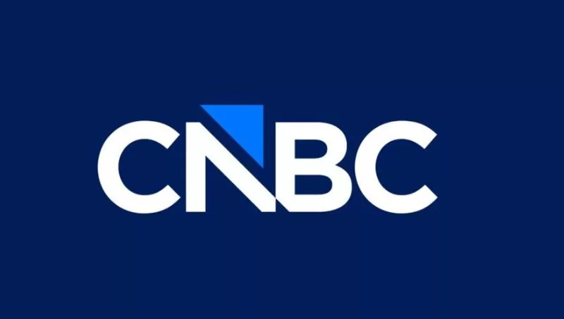
The peacock (introduced in 1996) wasn’t a bird; it was a power treaty—symbolizing luxury, exuberance, confidence, and a panoramic view—its feathers unfurled over the markets. Its visual death isn’t an upgrade; it’s a capitulation. The arrow that replaces it, the “blue triangle slicing the N,” per the official narrative, represents “direction and evolution.” In blunt reality, it signals reduction, utilitarian function, and turning a media brand into a tool.

Deconstructing the Rebrand: Anatomy of a Strategic Simplification
The new CNBC logo, activated on December 13, operates on three layers of meaning, each more revealing than the last:
-
The Semantic Layer: From Symbol to Sign
-
The Peacock (1996-2025): A symbol of abundance, broad vision, and ornamental authority. It was a brand that displayed itself.
-
The Arrow/Triangle (2025- ): A sign of direction, movement, data. A brand pointing outward (the market, the trend). As semiosis scholar Virginia Valdez notes in Brand Icons, “the replacement of organic icons with pure geometric shapes marks the shift from a value-based identity to a function-based one.”
-
The Typography Layer: Return to Origin (Or a Forward Escape?)
The Gotham usage—the typeface behind Obama’s Hope, Airbnb—coupled with narrowing the N and B to evoke the original 1989 logo is a contradictory move. On one hand, it seeks modernity (Gotham); on the other, nostalgia for legitimacy (1989). It’s the gesture of a brand adrift between a glorious past and an uncertain future, freezing its identity in a sterile before-and-after.
-
The Strategic Layer: The Versant Context
This rebrand doesn’t happen in isolation. It’s the opening pawn move on Versant’s chessboard, the NBCUniversal cable-portfolio’s new home. CNBC changes its skin to differentiate within a portfolio (USA Network, E!, Syfy) and, crucially, to align visually with the holding-company logic that values systemic coherence over singular identity. It’s a logo designed to fit a corporate PowerPoint, not to dominate a television screen.

The Divided Answer: Minimalism or “Anti-Woke”?
-
Public reaction isn’t about aesthetics; it’s about cultural narratives. Critics who see a “new victim of minimalist trend” point to something deeper: global homogenization of corporate design, where identity is sacrificed on the altar of scalability and legibility on a smartphone.
-
Those who read the change as an anti-woke response read between the lines: the peacock was flamboyant, exuberant, almost baroque. The arrow is cold, directional, “masculine” in the stereotypical sense. In a polarized cultural climate, even a logo redesign becomes a battlefield for ideology.
-
As Adweek’s creative director Marcus Hewitt puts it: “When a brand abandons a recognizable icon for a geometric abstraction, it isn’t trying to be loved; it’s trying to be unassailable, neutral, and functional. It’s the fear of offending aesthetic.”
15 Neuro-strategic Principles of Rebranding in the Era of Disintermediation
To decode what CNBC is really doing (and what your brand can learn or avoid):
-
The logo change is never about the logo. It’s about reconfiguring the psychological relationship with the audience. From the admiring spectator (the peacock) to the user-oriented (the arrow).
-
The peacock was an emblem of the broadcasting era, one-directional. The arrow is an icon of usefulness and data.
-
Internal rebranding done “in-house” often reflects a myopic, insular vision disconnected from public perception.
-
Justifying “keeping the family identity” while changing the most familiar element is a classic corporate oxymoron.
-
The arrow as a “stock symbol” is a post-hoc rationalization. First comes simplification; then a meaning is sought.
-
In the Versant context, CNBC isn’t redesigning for itself; it’s redesigning to be a coherent asset within a sell‑or‑merge package.
-
Gotham is the “21st century Helvetica”: democratic, clean, and profoundly generic.
-
Dropping color and complexity is an implicit concession to the supremacy of mobile screens.
-
An identity that’s “polarization-proof” (minimalist, abstract) often ends up being an identity without soul, easy to forget.
-
The change coincides with Comcast separation: a corporate rebirth ritual, a visual baptism for the new Versant entity.
-
Public tepid response is the worst result: indifference is more deadly than hatred.
-
MSNBC becoming “MS NOW” reveals the same strategy: extreme acronymism and literal utility.
-
The real risk isn’t losing the peacock; it’s losing the emotional equity built up over 30 years of crises and stock booms tied to that symbol.
-
In the attention war, excessive simplification can be a differentiating suicide. You become another blue tile in a sea of blue tiles.
-
The lesson for brands in Miami and around the world: minimalism isn’t a strategy; it’s an aesthetic. Strategy must live in the narrative that the aesthetics sustain. If the narrative is merely “we’re modernizing,” you lose everything.
Evolution or Degeneration?
-
CNBC’s rebrand will be studied as a textbook crisis of identity in traditional media. They change their skin to appear agile in a digital world, but the gesture is typically reactive, not visionary.
-
For CNBC, the arrow may point a direction, but the crucial question is: toward a future of renewed relevance, or toward a chasm of corporate generosity?
-
The peacock, in its excess, was memorable. The arrow, in its efficiency, is interchangeable. In the attention economy, what’s memorable will always beat what’s interchangeable.
-
For Miami observers, the message is clear: before launching a minimalist redesign, ask not only “do we look modern?” but “what part of our soul are we sacrificing on the altar of modernity, and is the price worth it?”
Because sometimes, in the pursuit of looking like a forward-leaning arrow, a brand ends up simply as another straight line in a universe of straight lines. And the world, especially the business and finance world, was built with curves, feathers, and complexities.
Do we really want to give all that up?
Read Smart, Be Smarter.
Infonegocios Miami—Economic, Cultural, and Business Intelligence with a Global Lens
Síguenos para más análisis: @InfonegociosMiami
Read Smart, Be Smarter!
https://infonegocios.miami/suscribite-al-newsletter
Contact: [email protected]
Infonegocios NETWORK: 4.5 million Anglo-Latinos united by a passion for business.
Join us and stay informed
© 2025 Infonegocios Miami.


Tu opinión enriquece este artículo: