Tips:
-
Although the new logo brings the best of the past, the brand seeks to offer a nod to the future with a more modern and bold typography.
-
The sphere gains prominence in Pepsi's new identity and is reinforced by a background in a darker and more electric blue and with the new black frame.
-
The brand improves in recognition and strength. Its challenge is adapting to the very long cans in some countries.
-
The use of the logo promises a visual impact seldom seen in the world of branding due to its clarity and impact.
In this report, we show you the evolution of the branding of this brand beloved by millions of people from 1898 to today.

Summary:
Pepsi has amazed everyone with this strong, innovative, full-bodied design, in an ideal mix of history and future. Its current colors with huge eye-catching ranges of blues in combination with black and of course with a touch of red have much more to do with the current era than even the red and white prominence of its main opponent.
Why return to the 70s-90s?
Historically, Coca-Cola has had a larger market share than Pepsi both globally and in the United States. However, there have been some moments when the two brands were more even in terms of share. In the 1970s, Pepsi launched an advertising campaign called "The Pepsi Challenge," which compared the taste of Pepsi to Coca-Cola in blind taste tests. The campaign was a success and helped increase Pepsi's market share in the United States. In the early 1980s, Pepsi overtook Coca-Cola in market share in the United States for the first time since the 1930s. In the global market, there have been some moments when Pepsi has achieved a closer market share to Coca-Cola's. For example, in the 1980s, Pepsi achieved a greater presence in some Latin American and Asian countries. Additionally, in the 1990s, Pepsi acquired several beverage and food companies, which allowed it to expand its presence in the global market. Pepsi always encourages new variants of traditional flavors, clearly sweet, with a mix of hidden acids, and for lovers of new flavors, Pepsi is incomparable.
The personality of a leader in strategic differentiated segments
Although Coca-Cola has maintained a larger market share than Pepsi both globally and in the United States throughout history, Pepsi leads in segments of innovative and cosmopolitan cities, in most of Asia, and in young segments.
Pepsi has historically targeted a younger audience and developed advertising campaigns that emphasize emotion, energy, and fun. In comparison, Coca-Cola has focused on more traditional advertising campaigns that promote happiness, family, and friendship. In terms of personality characteristics, Pepsi has developed advertising campaigns that focus on celebrities, famous musicians, and athletes, who often have a strong presence on social media and a connection with young people. For example, the "Pepsi Generations" advertising campaign featured music stars such as Michael Jackson, Britney Spears, and Beyoncé. It has also been said that Pepsi tends to attract people who prefer sweeter and less intense flavors than Coca-Cola's. Overall, the preference for a beverage brand is a personal choice and can be influenced by factors such as culture, advertising, and personal.

Where the "Queen" is the King of beverages?
Pepsi has a greater presence than Coca-Cola, for example, in India, Pepsi has a market share of 36.5% compared to Coca-Cola's 33.8%. In Pakistan, Pepsi has a market share of 60%, while Coca-Cola has only 40%. There are also countries like Canada and Scotland, where Pepsi is more popular than Coca-Cola.
Pepsi, countries where it leads the market.
-
Pakistan
-
Bangladesh
-
United Arab Emirates
-
Saudi Arabia
-
Kuwait
-
Iraq
-
Oman
-
Qatar
-
Bahrain
-
India
-
Canada
-
Scotland
-
Puerto Rico
-
Nepal

What is its renewed and strengthened image like?
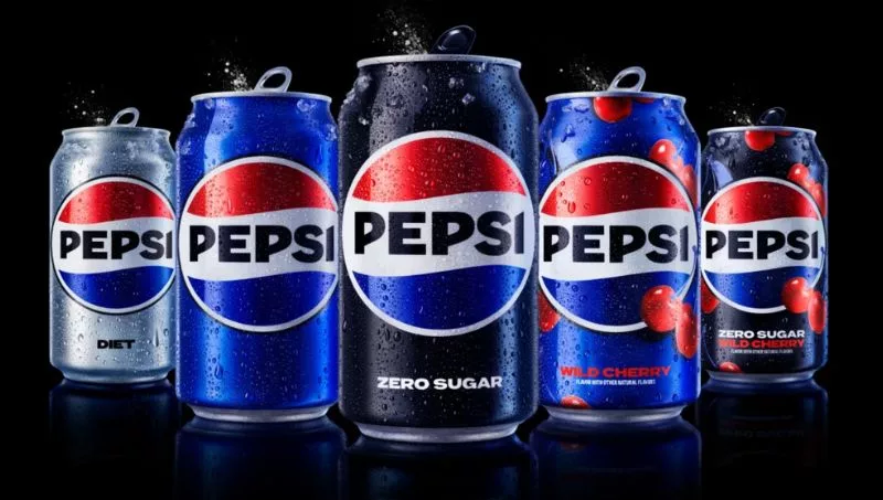
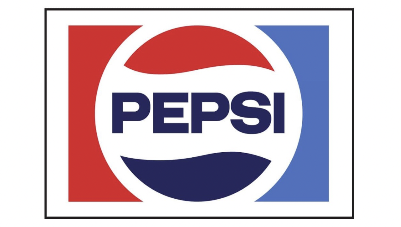
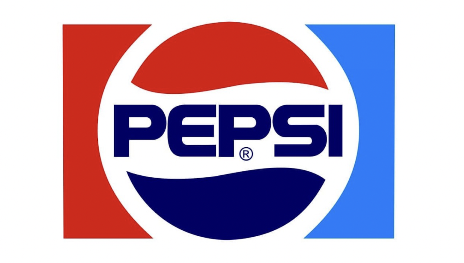
The Pepsi beverage brand has renewed its logo, returning to its classic cut after the 2008 design. The new design reintegrates the name into the circle in uppercase letters, a formal singularity that has accompanied the Pepsi logo from 1950 to 1986 and, more specifically, in the 90s, from 1987 to 1997.
The previous Pepsi design was the subject of extensive debate. The new logo broke with the previous identity, showing the brand name in a stylized lowercase font, independent of the symbol. While this change generated movement, it also generated confusing effects that did not improve the brand.
The new Pepsi design, although it looks to the past in its form, has a more modern and bold uppercase font that offers a more futuristic and bold identity. According to Todd Kaplan, CMO of Pepsi, the new font is "bolder" and with the new design, the Pepsi logo gains greater visual strength.
The new design has a clear retro look, similar to the identity work done by Jerome Gould in the late 1960s. The new Pepsi identity has been launched with a presentation video that highlights the dynamism and wavy effect of the red and blue stripes of the Pepsi logo, a new, more vibrant look with echoes of urban culture and graffiti.
While the new design improves brand recognition and strength, it remains to be seen how it will adapt to the long cans that we have in Spain. In any case, the renewal of the Pepsi logo is an important step in the evolution of the brand and a strategy that will undoubtedly be closely followed by branding experts.

The queen is renewed and it is a success
Without Pepsi, Coca-Cola, and vice versa. What few strategists know and share is that disruption in most of the history of this competitive market has been the responsibility of Pepsi. To expand, make mistakes, make the leader mistake... There is another leader, the queen (as mentioned in many academic circles and also by fans of its taste).
History says that Pepsi, almost bankrupt in the 50s, could have been bought by Coca, and it did not. They needed it. Ford needed Chrysler, like Microsoft needed Apple, Mercedes needed BMW. In history, leaders, who in certain segments function as one and in others as two, are always complementary in order to choose, distinguish, compete, and improve.
However, the case of Pepsi has the great peculiarity of being a constant example of the challenge, which often wins and is very aggressive in its innovation, to the point of modifying the entire market context.
This time, Pepsi dares, once again, to do more, and nothing less than in its branding.
The evolution of branding from 1898 to 2023

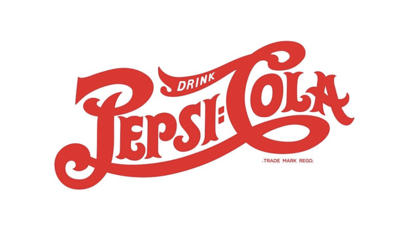
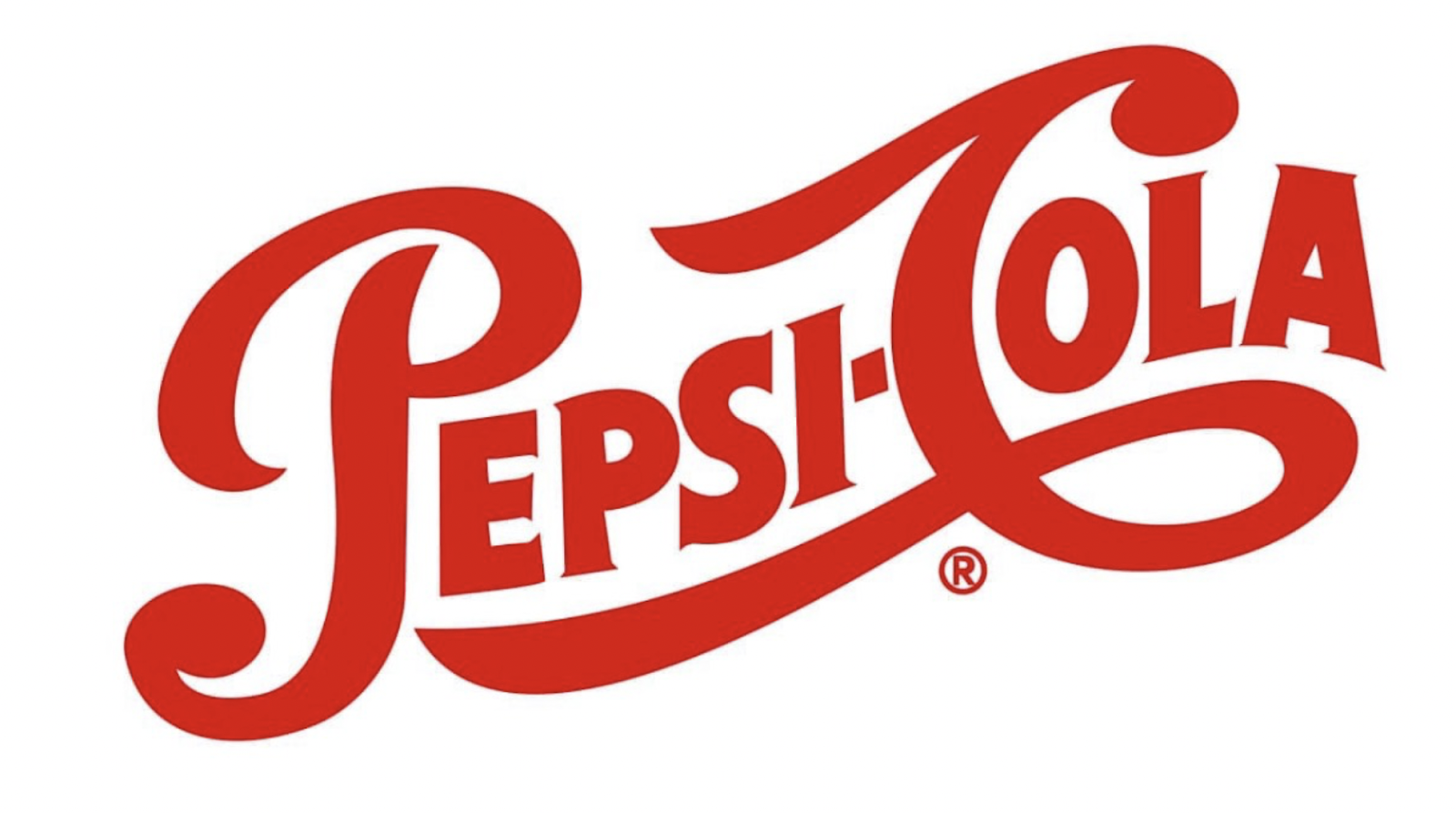
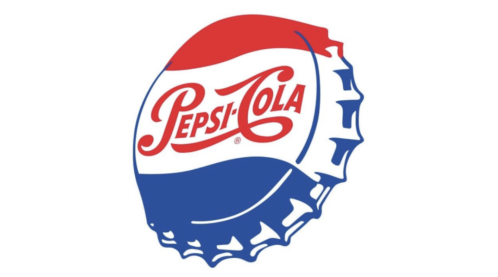
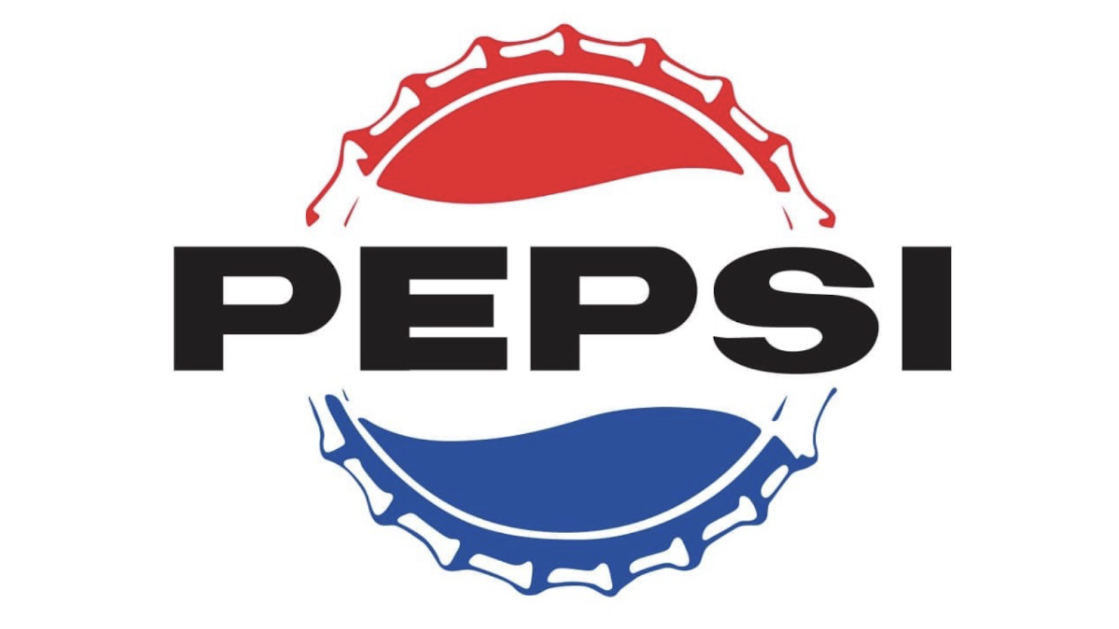

The evolution of branding from 1898 to 2023.


Tu opinión enriquece este artículo: