https://www.youtube.com/shorts/fOrfTzhx2so
Dossier:
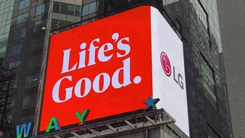
LG changes its global brand identity to conquer Generation Z. LG's new visual identity focuses on expressiveness and dynamism, and its goal is to convey the brand values to all users, regardless of their location in the world. The brand has reinterpreted its warmth and sense of unity to drive interaction with more customers through a new visual identity that adds vitality and interactive elements.
The LG symbol, composed of the letters L and G, can perform up to eight different gestures, such as nodding, winking or spinning on itself. The logo now features a new color, LG Active Red, more vibrant than its previous tone, and various gradient elements can be applied in different tones to adapt to the unique characteristics of each product or service.

The brand's slogan "Life's Good" will be used more widely in product packaging, and a new typography inspired by various LG products has been introduced. Overall, LG's new visual identity offers a more dynamic, youthful, and attractive image for younger users, without losing brand ecognition through the symbol that has been reinforced with movement and new expressiveness.
The rebranding includes the introduction of a new pink color, "LG Active Red," which will be used at all points of sale and customer contact, as well as a renewal of typography and digital expressiveness while maintaining the iconic logo and slogan "Life's Good."
To make the logo more expressive, LG has animated eight different logo movements, from nodding, spinning, and smiling, to winking to give greater consumer engagement.
LG's rebranding follows the trend of other successful brands such as Apple, Google, Microsoft, and Intel, who have updated their logos to make them more appealing to Generation Z, with clean, minimalist designs, and vibrant colors.
History of a great logo:


Conclusion:
LG's rebranding is an effective strategy to connect with a new audience and adapt to a constantly changing technological landscape. The success of this initiative will depend on LG's ability to keep up with Generation Z's preferences and continue to innovate in the future.


Tips for the rationale for change:
-
Staying up to date with Generation Z's preferences is crucial to a brand's success in a constantly changing technological landscape.
-
Renewing logos reflects the brand's evolution and innovation and demonstrates that the company has a vision for the future and understands the preferences of the new generation of consumers.
-
Clean, minimalist designs, and vibrant colors are visually appealing to Generation Z.
-
Animating the logo is an effective way to make the brand more expressive and increase consumer engagement.

Analysis of the logo change strategy for LG:
-
Connecting with Generation Z: LG's decision to update its brand identity is due to its intention to conquer a new generation of customers, specifically Generation Z, who value freshness, authenticity, and innovation.
-
Maintaining the slogan: LG decided to keep its iconic slogan "Life's Good" to preserve its identity and not lose the recognition it has built over time.
-
Adding new colors: The new pink color called "LG Active Red" is added to the brand's characteristic red to give a more energetic and youthful look.
-
Typography renovation: The new typography for the slogan "Life's Good" reflects the brand's innovation and modernity while seeking to be more readable and friendly.
-
Digital expressiveness: The circular logo animation on digital platforms with movements such as nodding, spinning, smiling, and winking reflects the brand's evolution and freshness, making it more approachable and participatory for Generation Z.
-
Conveying a vision for the future: LG's brand identity renewal reflects the brand's evolution and innovation, indicating that the company stays up to date in a changing technological landscape and has a vision for the future to meet the preferences of younger consumers.
-
Simplicity and minimalism: The current trend in logo design is towards simplicity and minimalism, so LG has simplified its design to achieve a cleaner and more contemporary visual identity.
-
Great applied art innovation in logo design, to be more expressive, LG has animated eight different logo movements, from nodding, spinning, and smiling to winking to give greater consumer involvement.


Final summary:
LG has modified its global brand identity to make it more appealing to Generation Z, with new colors, typography, and digital expressiveness, while maintaining the iconic logo and slogan "Life's Good". The logo renewal reflects the brand's evolution and innovation, and demonstrates that the company has a vision for the future and understands the preferences of the new generation of consumers.
At Infonegocios Miami, we are attentive to your cultural, social, and commercial interests:
If you want to communicate with us, please do so at: [email protected] to learn how to participate in our content and join our network of contacts and events, or you can also do so at [email protected]. Thank you very much.


Tu opinión enriquece este artículo: