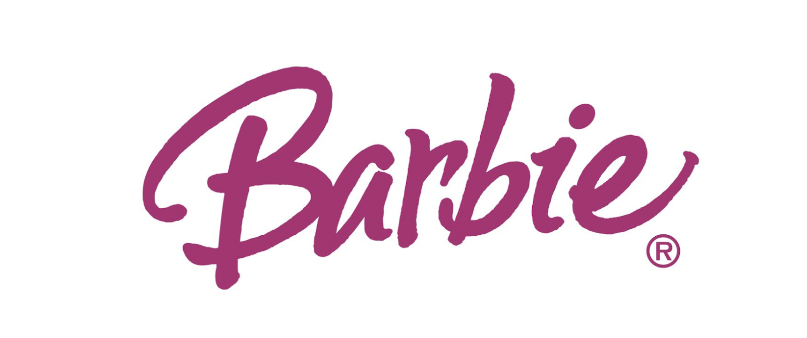
The Brand that Returned to its Original Logo: Barbie's visual identity is one of the few examples where a brand returns to its original version after numerous redesigns. In 2009, the company decided to go back to its roots, readopting the first version of the elegant feminine logo as its official emblem once again.
Analysis of Barbie's Original Logo from a Marketing, Branding, and Neurolinguistics Perspective: Barbie's original logo presents a handwritten font that evokes a spontaneous and charming style. Compared to previous Barbie emblems, this design stands out due to its uneven lines. The first letter "B" is the lowest, while the "a" and "r" rise much higher, and the second "b" is almost as low as the first.

This asymmetry creates a sense of movement and lightness in the logo. If the letters "i" and "e" were lower than the second "b," it would have formed an arc, but by jumping almost as high as the "ar," an unexpected and relaxed effect is achieved. This design suggests an effortless and carefree approach, reinforcing Barbie's image as a mischievous yet adorable figure.
A decade later, the brand adopted a 3D version of this logo, which was later replaced by a completely different style in 1975. This new emblem departed from the ease of the previous logo and opted for a bolder and more cheerful approach. All letters, except the initial capital "B," now had the same height and followed an upward line.
The shift to an ascending line in the 1975 logo evokes a sense of optimism and happiness. The initial "B" becomes the focal point of the design, with two distinctive curves that give it a unique identity. The difference in the size of the curves adds a playful and appealing touch.
Furthermore, the use of slightly thicker ends in all letters creates a subtle "handwritten" effect, adding a sense of authenticity and spontaneity to the brand. Overall, this logo conveys a message of fun and joviality, enhancing Barbie's appeal to its audience.
These logo design changes over time reflect the evolution of the Barbie brand and how it has adapted to market preferences and expectations. The application of neurolinguistics in the analysis allows us to understand how certain visual elements can influence the perceptions and emotions of the target audience, creating deeper and more lasting connections with the brand.
The Great Lesson from Barbie's Case to the World: The true business is the business behind the business; that is, the added value and expansion of the brand's world beyond the primary product are much more valued and profitable. It's simply because it enriches the experience of a product and its brand in a fun way.
Don't miss this real crash course in Marketing and Branding in this report: [link to the report].
Undoubtedly, another significant lesson from Barbie is the importance of valuing and caring for the logo, the brand, and the branding.
Exploring the Fascinating Evolution of Barbie's Logo: An Icon of Design and Branding:
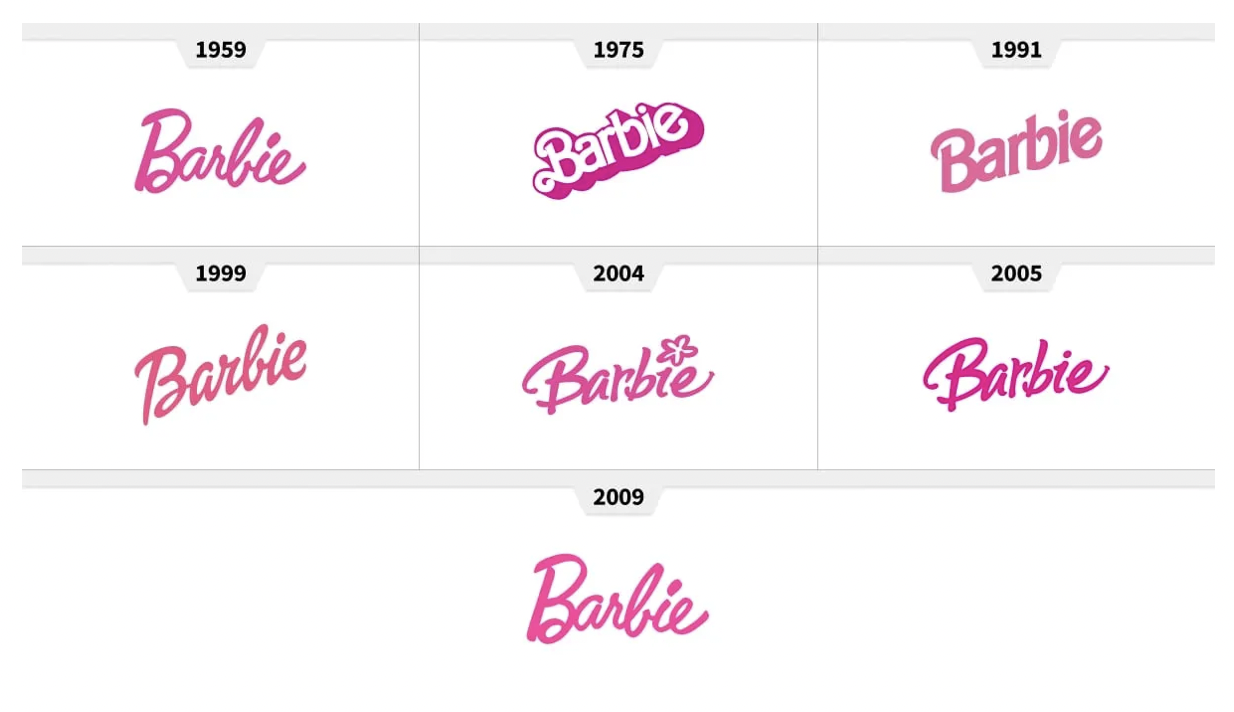
Barbie's logo, in all its incarnations, has played a pivotal role in the brand's triumph. Despite multiple changes in font, color, slant, and other elements, its core essence remains intact. Since its creation in 1959, the logo has undergone five major redesigns, with the company ultimately reverting to its original emblem.
What is Barbie's characteristic color?
Pink is the first color associated with girls of all ages, and Barbie is also a girl, a lady who loves pink more than any other color and uses its various shades for her wardrobe.
Why is Barbie's logo pink?
Barbie's logo is executed in a deep pink tone, closer to fuchsia. This is the characteristic color of the franchise and is most associated with the brand's soul and core. Pink is the color of style and elegance, the feminine and tender tone, evoking a sense of sophistication and style, and it looks very playful and feminine.
What is Barbie's logo?
Barbie's logo is a custom cursive wordmark, written in a designer typeface title, created exclusively for the brand. The letters are set in dark and bright pink shades, and the character outlines are smooth and elegant, perfectly representing the brand's essence.

The Fascinating Journey of Barbie's Logo: From its Creation to the Present
Let's go through each iteration of Barbie's logo over the years:
1959 – 1975: The Starting Point of the Visual Concept
In 1959, Barbie's first logo was designed, featuring a pink cursive inscription with letters gently rising above the edge. The uppercase letter "B" and lowercase letters made this design simple yet memorable.
1975 – 1991: A Radical Change, Preserving Certain Aspects
After 15 years, in 1975, Barbie's logo underwent its first major transformation. The inscription was placed diagonally, now with bold sans-serif typography and a wide bright pink shading, maintaining the brand's color while changing the style of the letters.
1991 – 1999: Eliminating Shading and Adding Elegance
In 1999, another significant change occurred in Barbie's emblem. The striking shading disappeared, and the inscription adopted a cleaner look with narrower sans-serif typography. The lines of the letters became smoother, and the pink shifted from bright to a lighter and tender tone.
1999 – 2004: The Return of Cursive
A few years later, cursive returned to Barbie's logo, along with the distinctive bright pink color. The diagonal placement remained, though with a slightly reduced angle, adding a touch of confidence and modernity to the logo.
2004 – 2005: A Brief and Playful Redesign
In 2004, for just one year, Barbie's logo underwent another change. The typography became more playful, featuring a distinctive graphic element: a flower replacing the dot above the "i." A hand-drawn design that stylized the emblem.
2005 – 2009: The Return of Solid Dot and Firmness
A year after incorporating the flower, it was removed to reintroduce the solid dot above the "i." However, the logo maintained its handwritten, friendly, and playful typography, aligned with the brand's values.
2009 – Present: Reverting to the Original Logo
After 50 years, the brand decided to go back to its original logo, rescuing the 1959 emblem and preserving it in its current form. This version perfectly captures the essence and style of Barbie.
Typography: Elegance and Sophistication
Barbie's logo features a handwritten, cursive, custom font exclusively designed for the doll company. It reflects the brand's femininity and adds elegance and sophistication to the emblem.
Corporate Color: The Power of Pink
Pink has become Barbie's iconic color. The brand has its own shade, called
Pink (Pantone 219C), a vibrant and alluring shade that symbolizes femininity and is instantly recognizable.
Color Palette: Beyond Pink
Barbie's logo color palette mainly consists of three colors: pink, white, and black. These colors have been consistently used throughout Barbie's history and are fundamental to the brand's visual identity.
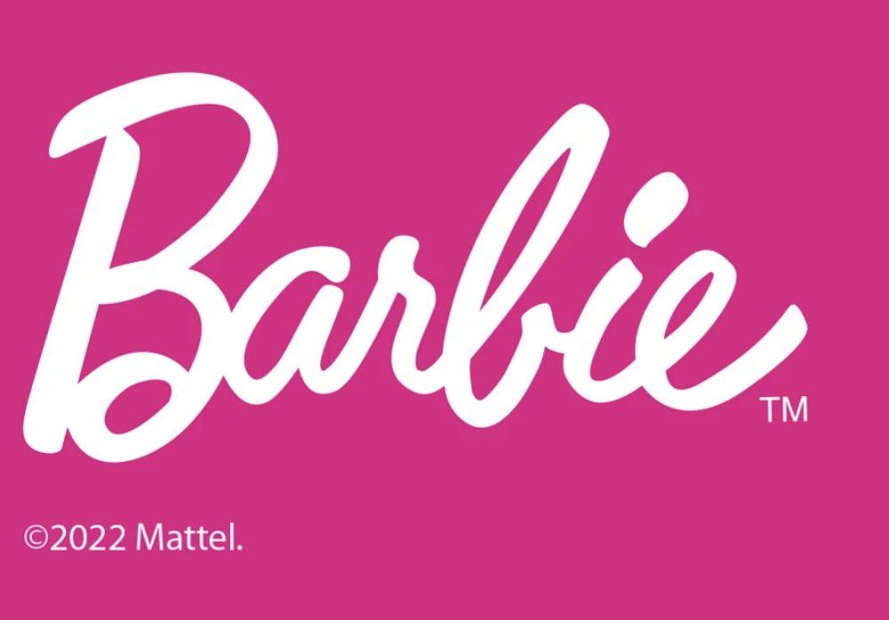
Pink takes center stage in Barbie's logo and is directly associated with the brand. It is used in different shades, ranging from a light pink to a more vibrant pink. It represents a symbol of femininity and is crucial for brand recognition.
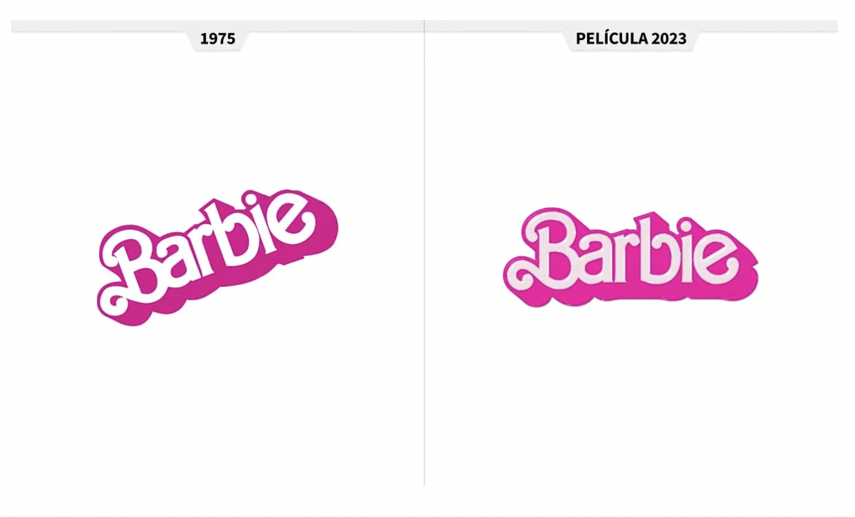
Pink Candy, one of the most important parts of the Barbie brand, featured in the 1975 version, presented a slightly cooler pink tone than its predecessor. As for the 1990 logo color, it resembled the original logo more than the 1975 version but was slightly lighter. The following logos became more saturated.
Curiosities of the Logo Design: Jewels and Notable Designers
Barbie's logo was created by the founders of Mattel Creations, Elliot and Ruth Handler, in 1959, when the "Barbie Doll" was brought to life.
Ruth was inspired after seeing her young daughter play with paper dolls. She drew inspiration from the German doll Bild Lilli and considered various designs and concepts for the brand's visual identity.

The Stylish "B" and its Connection to Barbie's Creator
The connection between the stylized "B" in Barbie's logo and Ruth Handler, the founder of Mattel and the creator of Barbie, is indirect but significant. The stylized "B" was designed to represent and highlight the Barbie brand, establishing the foundation of its visual identity.
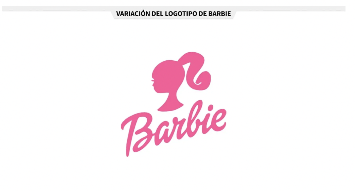
Special Variants and Versions of Barbie's Logo
While we all know Barbie's iconic pink logo, there are other variants that may be intriguing, such as Barbie's head with the brand name beneath, a captivating silhouette that conveys the brand's essence.
Additionally, the brand created a logo in black, demonstrating its versatility and elegance, ideal for various types of products, especially on colorful backgrounds where the pink logo may not be suitable.

Beyond Aesthetics: Controversies in Barbie's Logo
Throughout its history, Barbie's logo has faced controversies related to its design. Some critiques have pointed out the incorrect use of typography, questioning certain fonts and inadequate letter spacing.
Legibility has also been a topic of debate, as it may vary depending on the size of the logo or the visual context in which it is presented. Additionally, inconsistencies in reproducing the logo in terms of colors, proportions, or alignment have been discussed.
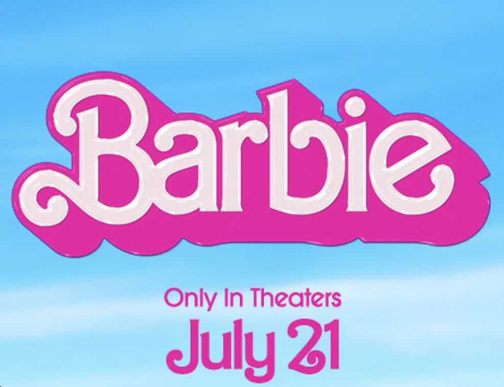
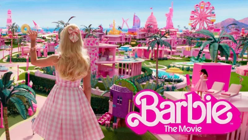
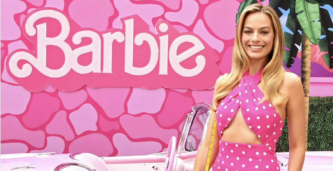
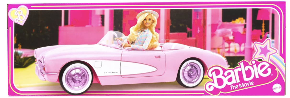
Barbie's Movie Logo: Connections and Differences
The logo for Barbie's upcoming movie, set to be released on July 21, 2023, shares some similarities with the brand's main logo. It retains the distinctive pink color, representing the brand's visual identity.
It also brings back the stylized "B" from the 1975 logo, as well as the shading from that same era. However, the tones are lighter and contrast against a sky-blue background. The logo also incorporates shiny elements that reflect on the edges, adding more appeal to the design.
Tips for Creating an Iconic Logo: Insights from Branding, Marketing, and Consumer Psychology Experts
Crafting an iconic logo like Barbie's requires a multidisciplinary approach, combining the expertise of professionals in branding, marketing strategies, and consumer psychology. Below are valuable tips from our panel of experts:
Embrace Simplicity: A timeless logo should be simple, memorable, and easily recognizable. Barbie's logo's elegance lies in its minimalist design, concisely capturing the brand's essence.
Maintain Brand Identity: The logo should reflect the brand's core values, target audience, and unique proposition. Barbie's logo embodies femininity, charm, and sophistication, aligning perfectly with its primary audience.
Consistency Matters: A consistent logo across time and all touchpoints reinforces recognition and loyalty towards the brand. Barbie's decision to return to its original logo showcases the power of consistency.
Understand Consumer Psychology: Consider how colors, typography, and design elements evoke emotions and influence perceptions. Barbie's pink tone represents femininity, connecting with its predominantly female audience.
Versatility for Adaptability: Create a logo that seamlessly adapts to various platforms, products, and media. Barbie's versatile logo variants ensure that its iconic emblem remains recognizable in diverse applications.
By heeding these insights, businesses can embark on a journey to craft a logo that transcends time and becomes an enduring symbol of their brand's success, just like Barbie's iconic logo.


Tu opinión enriquece este artículo: