Almost 50 years later, this logo remains one of the best examples of a city brand existing today. It has been the symbol of the city for decades, loved by both New Yorkers and foreign visitors. So why change it?
New York authorities have decided to carry out a new campaign that seeks to promote tourism in the city after three complicated years of the pandemic. And for this, they have had to replace the iconic emblem designed by Milton Glaser, I Love NY.
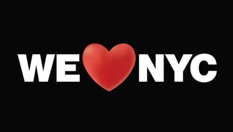
But in reality, it is not a radical change. Rather, it is an evolution of Glaser's original logo, a modification that goes from the individual - "I" - to the collective - "we." Thus, the emblematic I Love NY logo is replaced by We Love NYC.
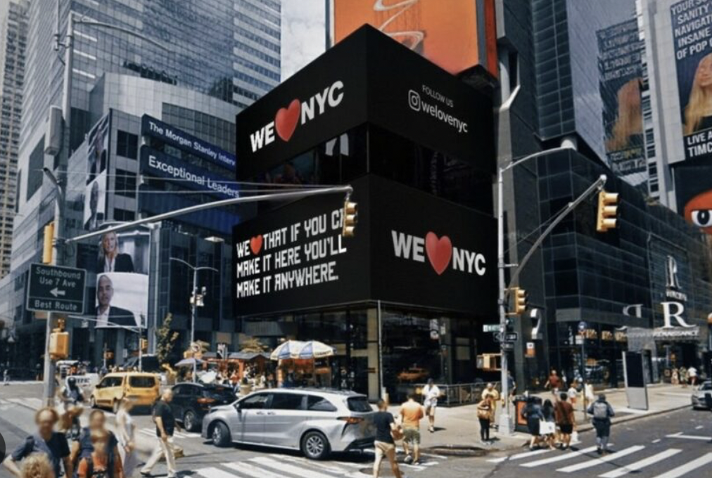
The main objective of the campaign is to mobilize all those who love New York to showcase what makes this city unique and revitalize it in every way. To this end, various activations have been developed in digital outdoor advertising in emblematic places such as Times Square, Madison Square Garden, and the Yankees stadium. There are also activations in the press, in the most relevant headers: The New York Times, Wall Street Journal, The New Yorker, and New York Magazine.
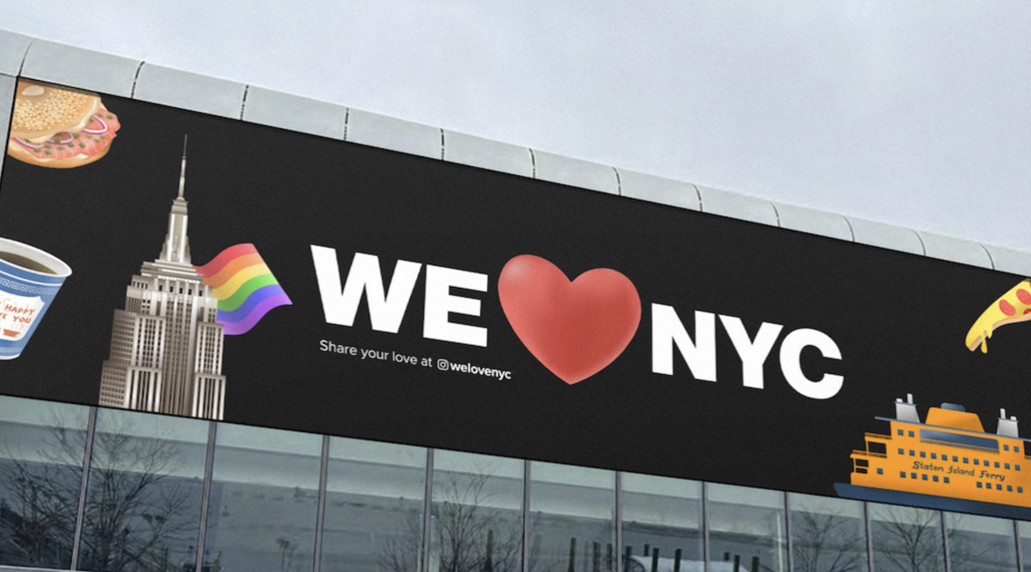
All the pieces of We Love NYC try to encapsulate the essence of New York and what it means to be part of the city. For example, the graphic communication of the campaign is supported by the use of emojis, international symbols that are understood in any culture. Therefore, the independent agency Founders Agency has developed a collection of emojis representative of the city, an open process that allows for creating new emojis according to citizens' requests.
In addition, one of the campaign's objectives has been to involve citizens in promoting the city. To this end, the help of different artists from By The New York, a network of independent agencies that have created a series of posters representing what New York means to them, has been requested. This initiative invites other artists from the city to create their posters, which will be shown on the campaign's official website and social networks.

In addition, the campaign also includes a 30-second spot that highlights the most outstanding tourist aspects of the city, such as nightlife, street food, and theatrical shows. This ad has a Spanish version and is being spread through various digital and television platforms.
Despite all the efforts made in the new campaign, it seems that it is not giving the expected results. In fact, the headline of The New York Times reflects the negative criticisms that the new 'We ❤️ NYC' logo has received: "These New Yorkers don't ❤️ the 'We ❤️ NYC' logo." Many people have criticized the typographic adaptation of Glaser's new logo, which has generated some controversy.
In this situation, artist Ryan McGinness has offered his own version of the logo to improve its typographic adaptation and, hopefully, improve the public's perception of the new logo. Additionally, other artists in the city have been called upon to join in creating posters and advertising that reflect what New York means to them.

From "I ♥︎ NY" to "We ♥︎ NYC." The author finds it curious that the shift from individual to collective, as well as the appearance of the new logo. "I ♥︎ NY" is a personal, proud, and defiant statement, and the author believes it perfectly reflects the mood of New York. In contrast, "We ♥︎ NYC" seems to have been written by a committee, and the author finds it lacks the same strength and personality. Furthermore, the author notes that Glaser's original work was based on his own memories and experiences, while "We ♥︎ NYC" seems to be a mere echo without solid foundations.
The author highlights that defining the brand of a city is not a trivial task, especially in the case of New York, a tough and complex city. Glaser's original design has been imitated and ripped off in recent years, demonstrating its impact and quality in the city. The author doubts that the new logo will have the same relevance and recognition in the future, and bets that "I ♥︎ NY" will continue to be a reference in popular culture, even in 50 years.

What did this campaign show?... that it is not enough to simply do what a plan dictates by optimizing costs and coordinating relevant actions, nor is it enough to generate a concept with a suitable campaign and a good media mix. Today and always, it is necessary to do everything necessary for a campaign to be successful, and that typically involves much more than what is being invested in every sense. In teams, time, media, experiences, investment, events, co-creation, we are falling terribly short...
The boom of doing everything quickly, online, by target, by Google, "focused" has disconnected us terribly from human reality, from anthropological, emotional, morphological, sociological, psychological knowledge of communication. Advertising needs much more advertising. The media needs much more media, events, and experiences.
Creation is equal to investing more time, more listening, and more tact than the new accelerated media planning is recommending. The first thing to do is to work much more on the physical, sensory, activities, really make a cross of experiences. Work on public relations.
The advertising medium and designers, as many media declare, are a very critical, very egocentric, very closed cluster paradoxically. But isn't art also like this? Isn't the world of theater and cinema the same? Isn't the world of classical music similar? It is clear that this creative environment is destroying all the logo change, and this sector feels the need to defend symbols, personalities, more artisanal, bohemian forms that were part of a glorious culture seeking natural and deserved revaluation, and in many cases had a mystique of talent for their time and "freedom" that today is not respected, not valued, and clearly lost the common sense criterion against the hyper-speed of all the implementation imprint driven by the dynamics of apps and the online world.

Creatives and designers are the validated influencers in this matter. It is also obvious that ordinary people cling to traditional things, which are always perceived as better, except when very "clever" industries like music have really managed to impose current products and developments with a decrease in elemental quality components, based only on rhythm and aesthetics, minimizing melody and harmony, pillars of quality and creativity in that art.


Tu opinión enriquece este artículo: