Jue 23/01/2025
Stargate: Trump Announces US$ 500 Billion Investment in AI Infrastructure (AI Tokens Surge)
(By Taylor from Silicon Beach, with contributions from Maurizio) The Strategic Digital Transformation of the U.S. President Donald Trump's recent announcement of a monumental $500 billion investment in artificial intelligence (AI) infrastructure has captured global attention. (Stargate AI project) In a landscape where technology is advancing at breakneck speed, this initiative aims not only to position the United States as a leader in innovation but also to generate an immediate impact on cryptocurrency markets and job creation. The launch of the Stargate joint venture, in collaboration with giants like OpenAI, Oracle, and SoftBank, promises to revolutionize the nation’s technological landscape.
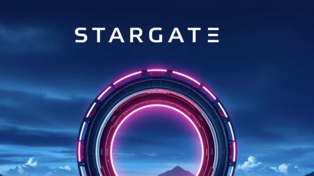
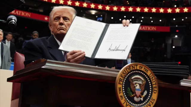


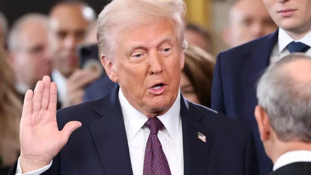


(By Taylor from Silicon Beach, with contributions from Maurizio) The Strategic Digital Transformation of the U.S. President Donald Trump's recent announcement of a monumental $500 billion investment in artificial intelligence (AI) infrastructure has captured global attention. (Stargate AI project) In a landscape where technology is advancing at breakneck speed, this initiative aims not only to position the United States as a leader in innovation but also to generate an immediate impact on cryptocurrency markets and job creation. The launch of the Stargate joint venture, in collaboration with giants like OpenAI, Oracle, and SoftBank, promises to revolutionize the nation’s technological landscape.